(Courthouse in Montreal, Quebec, Bryan Peterson. Understanding Exposure, page 105) I live the colors in this image because they are bright and the light shines in and makes them brighter. The colors go well together because they are not close enough to clash and they are springy colors so it makes the mood brighter.
("Lincoln Memorial", Bryan Peterson. Understanding Exposure, page 164 ) The reason I picked this photo to be symbolic is because it is symbolic to our nation. The lights on the pillars were added to the monument to make it more symbolic. The importance of this image in indescribable. It represent our nations pride of Abraham Lincoln and what he did for our country. The colors just add to the image to make it more important.
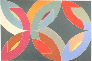
(Frank Stella, Lac Laronge IV , 1669) The image has repetition with the flow of it because it repeats the same shapes. The image has fusion because it has colors touching the same edges. It contains the same shapes but different colors within each repeated shape. It contains full circles and half circle which gives the image fluency because all the sections are curved. The image shows the grouping of the half circles shown in the image. It has a great color flow and distract from the focus of the image. It keeps the viewer's eyes flowing throughout the image.


Comments
Post a Comment