Posts

Showing posts from October, 2017

HW9- Color Inspiration

Image
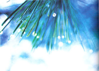
I actually took this image about a year ago and grown to love it. I have an edited version as well with selected color of the broach. I chose this image because it has a color scheme you do not see everyday. You can see the shadows of the image and see where the light hits the broach. You can see the lightest and darkest parts of the image. It has blues, pinks, while, and a little yellow in the middle of the flower. I think the color go great together. The yellow really stands out even though there is very little of it.  The pixelated version, you can see all the the different tints of the blue periwinkle color. You can see three different yellows, and different shades of the pink. You could also make out a black to white color scheme from this image.

HW8 Positive/ Negative Space

Image
("Make a Note" Andrea Scher. Expressive Photography . 71) This image defines positive and negative space well. The letters on the fridge is a good way of creating both negative and positive. If you try to dray the negative space, you could tell what the letters were without drawing the actual letters. The window frame gives good negative space from the outside as well. But the pictures, and appliances give great positive space as well. 

Random

Image
("Pine Tree", Stephanie C. Roberts. Expressive Photography , 50) I love this image because I love the colors. It gives the green tent to the leaves but also the blue background mixed in with it as well. You can see the water droplets on the leaves of the tree to give it more value and character. There is a vanishing point with the image, and it is going off the page, but we know there is one. The colors blend so beautifully and it makes it enjoyable to look at. 

Random

Image
("Parisian Street", Tracey Clark. Expressive Photography , 136) I liked this image because the lines on the building are not just straight up and down. They are diagonally up and down which gives the image more value. This image does have a vanishing point with the lines from the top and bottom of the building going toward the left side of the image. The lighting also caught my eye because the light is coming from the top left of the image and you can see the light rays. It shows the shadows from the objects in the image which gives the image more value. 

Random

Image
("Rustic Roost, Sarah- JI. Expressive Photography, 137) I like this picture because it shows a lot of compositions in it. It has repetition because the roosters are all sitting on the rail. It also has isolation of the rooster not sitting on the rail at the bottom of the image. 

Random

Image
("Cave of Green" ,  Karen Walrond.  Expressive Photography, 56) I chose this image because it describes this time of year because the leaves are transitioning into warmer colors and are starting to fall. It is an assortment of random balance within the leaves being on the branches every which way. The color assortment evens out as well. The greener leave are brighter and clearer than the orange-red colored leaves. This is because warmer colors have more weight and more saturated and the cooler colors are less saturated and lighter.