Posts

Showing posts from December, 2017

Symbolic

Image
("Lincoln Memorial", Bryan Peterson. Understanding Exposure, page 164 ) The reason I picked this photo to be symbolic is because it is symbolic to our nation. The lights on the pillars were added to the monument to make it more symbolic. The importance of this image in indescribable. It represent our nations pride of Abraham Lincoln and what he did for our country. The colors just add to the image to make it more important. 

Random

Image
(Courthouse in Montreal, Quebec, Bryan Peterson.  Understanding Exposure, page 105) I live the colors in this image because they are bright and the light shines in and makes them brighter. The colors go well together because they are not close enough to clash and they are springy colors so it makes the mood brighter.  

Random

Image
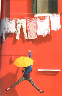
( Young and Limber Mary Poppins . Bryan Peterson, Understanding Exposure. page 71) I like the think this image is playful because it brings out how people should act like on a daily basis, joyful and playful. The colors even make the image playful. Yellow and bright red are the perfect colors to go with this image because it shows the joyful side of doing laundry. The colors do not clash with one another either. The shadows from the images work really well because you can tell where the light is coming from. 

Playful

Image
( Jumping , Bryan Peterson. Understanding Exposure , page 69)  This image is very playful because of the way the girl jumping. The people in the painting are being playful because they are playing against each other. The girl is tying to bring the image to life by jumping up and tying to get into the game. The colors also go well with the image because it brings out the people in the painting. 

HW12- Color Discord

Image
( Marilyn Monroe Series, Andy Warhol. 1967) These color discord work very well with Andy Warhol's screen printing of Marilyn Monroe. All of the colors are different but still work together. We can tell who it is even without a description because the colors are discord, but not as different as other images. They colors work very well together so it makes it look clean and not all over the place. 

HW14- Non-Commercial Art